Best Practices for Designing Effective Power BI Dashboards


Share


Introduction:
Developing a compelling Power BI dashboard extends beyond mere aesthetics; it’s about delivering actionable insights. Let’s delve into pivotal best practices to shape dashboards that are not only visually appealing but also offer substantial value.
Define Clear Objectives:
Before delving into the design process, articulate the dashboard’s purpose. Establishing the key questions, it should answer ensures a focused design that resonates with Power BI users, meeting their specific needs.
Simplify and Declutter:
Maintain a clean and clutter-free dashboard with a minimalistic approach. This enhances user experience, allowing them to concentrate on critical data points without unnecessary distractions, thereby optimizing the efficacy of your Power BI visualization.
Choose the Right Visualizations:
Visualizations serve as storytellers within Power BI dashboards. Opt for those that effectively convey your message. While classics like bar charts, line graphs, and pie charts are reliable, explore alternative options based on the nuances of your data.
Consistent Design and Branding:
Create a cohesive visual identity by ensuring consistency in color schemes, fonts, and branding elements. This fosters a professional appearance and reinforces your organization’s identity within the Power BI platform.
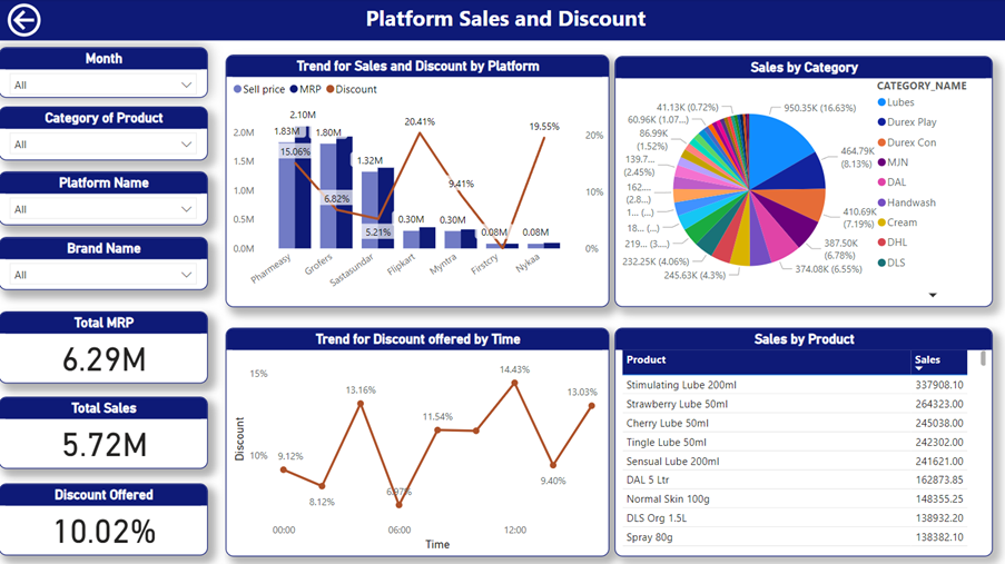
This picture showcases a Power BI dashboard designed with various visuals serving different purposes. The use of a consistent font and color scheme makes it look clean and attractive, helping to tell the full story.
Prioritize Data Quality:
Maintain data integrity by ensuring accuracy and currency. Regularly clean and organize your data to prevent inaccuracies. Remember, in Power BI, the adage “garbage in, garbage out” holds, making data quality a cornerstone of effective dashboard design.
Optimize for Performance:
Prioritize speed by trimming unnecessary calculations and limiting resource-intensive visuals. This optimizes Power BI dashboard loading times, providing a seamless user experience, and ensuring efficient data consumption.
Enable Interactivity:
Engage your audience within the Power BI platform by leveraging interactive features such as drilldowns and filters. Empower users to explore the data independently, fostering a sense of ownership over insights.
Documentation and Training:
Facilitate user understanding by incorporating tooltips and guides within the Power BI dashboard. This is especially crucial for users new to the platform, ensuring a smooth onboarding experience and maximizing the potential of your visualizations.
Regularly Review and Update:
Maintain relevance by regularly reviewing your Power BI dashboard’s performance against objectives. Update it as needed, ensuring that it evolves with the dynamic nature of your business. A constantly evolving dashboard ensures continued value within the Power BI ecosystem.
Conclusion:
Effective Power BI dashboard design strikes a delicate balance between simplicity and functionality. By incorporating these tips, you’ll create visually appealing dashboards and empower users with valuable insights, facilitating informed decision-making within your organization. Power BI becomes a transformative tool when these best practices are woven into the fabric of your dashboard design.
Ready to get started?
From global engineering and IT departments to solo data analysts, DataTheta has solutions for every team.