Power BI’s Role in Data Storytelling


Share


In the ever-evolving realm of business intelligence, the ability to weave a compelling narrative through data sets successful professionals apart. Enter Power BI, Microsoft’s formidable analytics tool, offering a canvas for crafting narratives through dynamic visualizations. In this blog, we delve into the core of data storytelling and how Power BI serves as your artistic tool in this creative endeavor.
The Power of Data Storytelling
While data alone may seem dry and intricate, when skilfully woven into a narrative, it transforms into a potent decision-making tool. Data storytelling is the art of translating raw numbers into a coherent and engaging tale that resonates with your audience. It transcends mere charts and graphs, aiming to make data relatable and easily understandable.
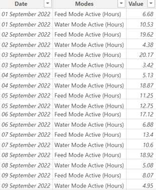
Raw Data
Visually compelling data story
Unleashing the Potential of Power BI
Power BI stands as an ideal platform for sculpting data stories, boasting an intuitive interface and robust visualization capabilities. With an array of chart types, maps, and customizable dashboards, Power BI empowers users to create compelling narratives that drive insights and actionable outcomes.
Steps to Craft a Data Story in Power BI
- Define Your Audience:
Recognize your audience and tailor your story to their specific requirements and interests.
- Identify Key Insights:
Before visualizing, pinpoint the crucial insights your data can offer. Determine the story you want to tell and the answers your audience needs.
- Choose the Right Visualizations:
Select visualizations that enhance your story and effectively convey your data. Power BI offers a vast collection of graphs, charts, and maps to bring your narrative to life.
- Create a Logical Flow:
Organize your visualizations in a logical order to guide readers through the information effortlessly.
- Add Context and Commentary:
Enhance your visualizations with context through annotations and commentary. Explain the significance of each data point, highlighting trends that contribute to the overarching narrative.
- Use Interactivity to Engage:
Leverage Power BI’s interactive features to allow users to explore the data themselves, fostering engagement and a deeper understanding of the story.
Real-world Examples
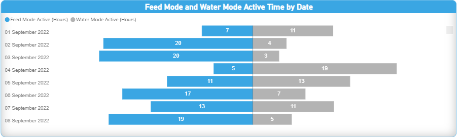
1.Sales Performance Dashboard:
Showcase a sales team’s achievements through a Power BI dashboard, highlighting fluctuations, successful strategies, and the impact of market dynamics.
Sales Performance Dashboard
2.Operational Efficiency Story:
Illustrate how process improvements increased efficiency using Power BI visuals, demonstrating cause-and-effect relationships through clear data representation.
Operational Efficiency Dashboard
Conclusion
Mastering the craft of data storytelling is imperative in the era of data-driven decision-making. Power BI serves as a creative tool, enabling individuals and organizations to communicate complex information in an engaging and approachable manner. Each chart, annotation, and color choice contributes to the narrative canvas. Utilize Power BI to unleash the creative potential of your data, telling a compelling tale that inspires action and fosters success.
Reach out to us for more updates like these.
Ready to get started?
From global engineering and IT departments to solo data analysts, DataTheta has solutions for every team.